Every little detail matters when you are trying to craft a product with delightful experience. It’s certainly becoming a trend for websites or apps to take the small, simple but inspiring interactions into their designs. Through those interactions, an emotional connection can be established between the product and users. And we say that’s the power of Micro UX.
Micro UX design is all about human touch. By applying small innovative elements into a product, the ultimate goal of Micro UX is to increase the efficiency of accomplishing a task while creating an humane experience that can help engaging users.
Numerous of examples can be found when we are talking about Micro UX. Some of them are aim at giving users a little bit of surprise so that finishing the task will no longer be that boring. However, the biggest chance lying in Micro UX is affecting users' expectation or even behaviour gradually through those subtle interaction designs. for instance, pull down to refresh gesture, or waterfall loading design, have become common-seen patterns in designs after being introduced.
So far most of existing Micro UX elements can be divided into 3 categories: Task focused design, Fun approach and Add-on feature. In this article, some examples were collected for each category, part of them are from Little Big Details, a fantastic library of Micro UX elements across website and mobile apps which worth UX designers spending some time exploring it.
A. Task focused design
One of the main purposes that Micro UX trying to achieve is to focus on users’ goal and satisfy their needs through delightful little designs. These designs may or may not be noticed by users, however, they can practically help prevent users from wasting their time and effort, which can make the flow more fluent and efficient.
1) Korea Air Ticket Booking system

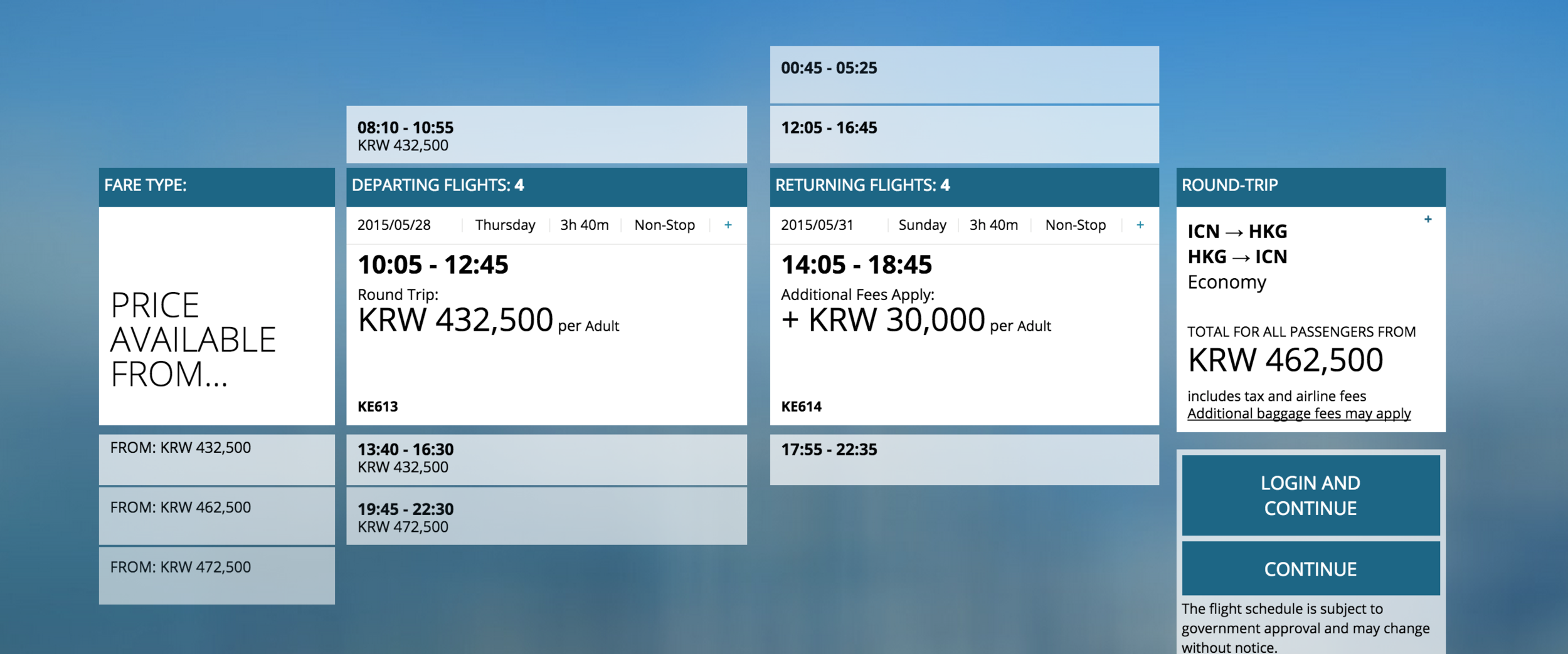
Korean Air is one of my favorite airline websites. The experience of booking tickets from Korean Air is quite smooth. The indications are clear, interactions are simple but engaging. Take selecting ticket combination process as an example, instead of boring forms and tables, Korean Air used the trendy card design. Users can either go for suggested package, or customize their own plan. By clicking or scrolling up and down among different options, the tabs been selected will expand accordingly for users to check the details.
Another interesting detail is, the background image changes based on the destination users chose. While waiting for the system loading information, the nice photo behind can really gave users an emotional touch. In this way, Korea Air showed their ambition of becoming an user-centered travel partner, instead of an airline company who sell tickets only.
2) URBIX: CAPCHA input design

As we might know, the pain of CAPCHA has been there for years, thus some websites have already replaced it with other methods like connecting users’ email or social network account to verify their identity. However, for a ticketing system like URBIX who might have users purchase tickets as guests, verify code is an essential barrier to prevent spam bots. Instead of manually inputting characters, URBIX is using selecting and match CAPCHA design, which can successfully stop the spams while letting real users quickly get through. Some other similar solutions for CAPCHA like matching images or even implement it as a funny little game are also being around, which made verify ID become less pain for users.
3) Gumroad: Log in & Sign up form design


Usually when users land on the login page but suddenly realize that they will have register first, then they will have to click on the sign up link and land on another page with none of the information that they may have inputted already. Apparently Gumroad considered situation like this, thus in their design, whenever users toggle between login and register forms, inputted content will stay in the fields. This design saved effort of inputting same content again while changing entry point. It’s undeniable that Gumroad has done a great job in designing Micro user experience, other than the login interaction, other form design like credit card and address input also worth exploring.
B. Fun Approach
It's never going to be a bad idea to keep your users happy while they using your product. That’s why more and more websites or applications put a lot of effort into engaging their users through some fun approaches. The methods could be various, gamification design, entertaining interaction or speaking humorous nature language, etc. However, the objective always remains the same: to provide a positive experience for users. When this applies to Micro UX, it means that producing a playful or fun element which would bring positive feelings to your users.
1) Virgin Airline: Avatars selection

In the booking system of Virgin America, when users reach the step of selecting seats, they will be able to choose their own cartoon avatar, just like what usually happen before a game starts. Once they done with seat selection, their user ID images will be displayed on the accordingly seats. So far, it seems Virgin America is the only airline website that using this approach in the journey of booking tickets. However, as a game changer in this industry, apparently Virgin America is leading the trend, and hopefully in the near future, there will be an increasing number of similar companies to adopt this gamification way of thinking.
2) Bellroy: interactive comparison

Instead of writing long paragraphs telling users how good their product is, Bellroy created this simple but interesting interaction, which allows user to move the sliders to see the performance between an ordinary wallet and their product. Compare to words or still images, an interactive animation will be much more persuasive and engaging. While being involved in the interaction, users can easily focus on the highlighted feature, chances of selling will increase at the same time.
3) 9GAG: ramdom generated profile picture

As a online platform of sharing humorous photos or videos, “Just for Fun” is 9GAG’s mentality. This spirit mostly presented in the content that they pushed, but at the same time, some details across the website is also found to be quite fun. One example is, when users register, the system will randomly assign a hilarious image as their profile pictures. It may not be something prominent, but create little details that can bring a joyful experience to the users, and that’s the value of Micro UX.
C. Add-on Feature
Add-on feature is all about going beyond users’ expectation. It usually refers to something not on the must-have list, or those which may not have a very close connection with a product’s key feature either. However, it would good to have these add-on features if it’s possible. You may surprise your users by showing how thoughtful you are, who knows.
1) TEDX: Display the length of time for saved talks

There is a lot of good design details from TEDX website that we can talk about, including video filtering, floating video bar design, transcript function, etc. Other than that, there is one more little element for us to look at, which is on the Saved Talks page, instead of showing users the number of videos, they are displaying the total amount of time of all the saved talks. This makes it easier for user to judge how much time they are going to spend if they want to finish all these videos.
2) Google: Game for the offline mode

Imagine how frustrated you may get when there is no Internet connection. Google Chrome is trying to calm their users down by turns the offline page into a game. Not able to access the internet may not be something users would like to see, but at least Google is trying to decrease users’ frustration by offering something fun, like the game of a dinosaur, which was born way before internet was invented, running across the desert.
3) Invision: Browser tab displayed a remindier

As an excellent UX tool, Invision noticed the tab on the browser window and used it to create good experience. Instead of leaving a standard site name there, Invision used it as a reminder. Whenever users switch tabs while reading a blog, text on the tab will change to “Don’t forget to read this…”. It may not be something big and prominent, but all the little details are the little moments that may touch your users, and make emotional connection with them.
Summary
Any good UX designer should care about every little details within their products, that’s why there are more and more excellent Micro UX works pop into our eyes. They can be functional focused, or aimed at creating emotional connection with users. Either way, the deep concept lying inside is about user-centered. Think from a user point of view, care more than what they care, this is what makes a good Micro UX.


